Tutorial: Basic System Dynamics Modelling
This tutorial gives an introduction to the Simantics System Dynamic Tool. We will go over how to create, simulate and analyze a simple system dynamic model. After completing this tutorial, if you wish, there is an advanced tutorial that goes more in-depth on the advanced features of the tool. It is recommended that you give a quick glance at first few chapters of the documentation before starting. You should especially familiarize yourself with the workbench of the tool to know the terminology used in the tutorials.
We are going to create the classic prey-predator model. In our case the model will describe how the population sizes of mice (prey) and owls (predator) change over time. The basic idea around the model is to capture the dynamics of two different population sizes. Let's assume a starting scenario where there is a large mice population and a small owl population. Owls start eating mice decreasing their population, and in turn, giving the owl population the opportunity to grow due to good food availability. However, as the mice population is decreasing and the owl population increasing, at some point there won't be enough food for the entire owl population, leading to starvation and consequently to a decrease in owl population size. The decreased owl population size then allows the mice population to regrow, as they have a smaller number of natural predators on the hunt.
This tutorial is a walkthrough for creating and analyzing such a model.
Creating a new model
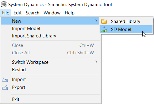
Start by creating a new model from File→New→SD Model.
Creating a new model
Rename the model to Population by slowly clicking twice on the model name in the Model Browser or by clicking the model once and changing the name from the properties view at the bottom of the tool. Then, expand the model tree and open the model diagram by double-clicking the Population model from Model Browser.
Configuring the model structure
Let's start by building a population model for the mice.
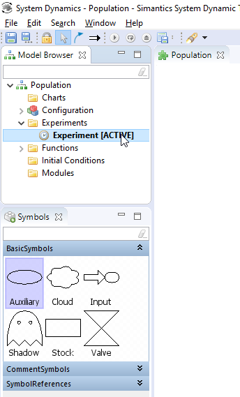
Drag the Symbols view from right of the Model Browser to underneath it and expand BasicSymbols for easier use. If BasicSymbols is not visible, make sure that you have the diagram open as the contents of the Symbols view depends on the active diagram editor.
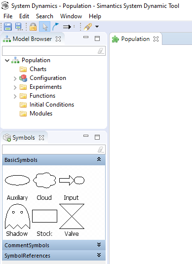
Symbols view
These are the basic symbols in System dynamic modelling that will be used to create the model.
Drag one stock variable from Symbols view to the diagram. You can zoom and move on the diagram using the middle mouse button.
Select the variable to bring up Properties view on the bottom of the tool. Change the name to Mice and press enter. You should have a red exclamation mark next to the symbol telling that the variable needs to have expressions for Integral and Initial Value fields. These are not shown in the pictures of this tutorial for visual clarity. We will write expressions to these fields later. You can find a collection of warnings and errors related to the model from the Issues tab right of the Properties tab.
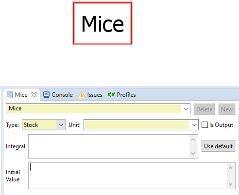
Stock variable Mice with the Properties view open, issues can be found on the third tab from the left
Next we will draw flows in and out of Mice. Drag one cloud variable from Symbols view to the left hand side of Mice. Hold down Alt and right-click on the cloud, then move your cursor on top of Mice and left-click. The system creates a flow from the cloud to Mice and a valve in between. The valve controls the speed of the flow, in this case the birthrate of Mice. We also need a flow going out from Mice to control the death rate. Let's create this using a shortcut. Right-click Mice while holding Alt down, then drag your mouse right of the Mice and press left-click while holding Alt down. Rename the valves to MouseBirths and MouseDeaths.
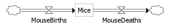
Flows in and out of Mice
Of course mice are not alone in our imaginary world. We also need owls that hunt mice. Create a similar structure for owls by copy-pasting and renaming. You can copy by drag selecting components and using the all familiar Ctrl+C and Ctrl+V.
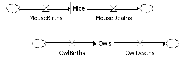
Owls and mice
To control births and deaths we use auxiliary variables. Auxiliary variables can be dragged from Symbols view just like Stock variables. We need one variable for each valve. Drag the variables and rename them according to the picture below.
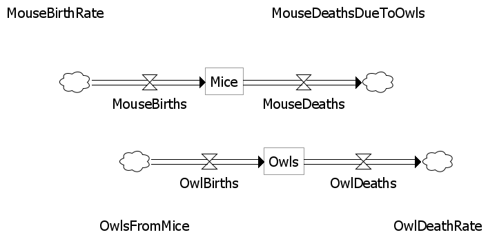
Auxiliaries for valves
Next we need to draw dependency arrows to tell which components of the system have an interaction. Dependency arrows are created by Alt+left-clicking on a symbol and then clicking on another symbol. Connect components like in the picture below.
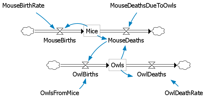
Dependency connections
Equations
Now we need to give each variable an equation, stock variables also need a value for initial population. Like names, equations can be configured from the property view. Input the following equations into the corresponding variables:
MouseBirths
= MouseBirthRate * Mice

MouseDeaths
= Mice * MouseDeathsDueToOwls * Owls

OwlBirths
= OwlsFromMice * MouseDeaths

OwlDeaths
= OwlDeathRate * Owls

MouseBirthRate
= 0.04

MouseDeathsDueToOwls
= 0.0005

OwlsFromMice
= 0.1

OwlDeathRate
= 0.09
Finally input initial population values for Mice and Owls.
Mice
Initial Value: 700

Owls
Initial Value: 10
Simulating the model
Now the model is configured and ready for simulation. An experiment needs to be activated before a model can be simulated. Expand the Experiments folder of your model and double-click on Experiment to activate it. This adds experiment control buttons to the toolbar.
Experiment activation
To simulate the model, press the play button:

System shows the simulation progress in the progress bar on the lower right corner of the screen. As our model is very simple the progress bar will most likely go by faster that you can see it.

When the progress indicator disappears, the simulation is complete.
After the simulation has been completed, you can select variables from the diagram or Model Browser and their values over the simulation time will be shown on Trend view. You can select multiple variables from the diagram by holding down Ctrl key or by drag selecting. Select Mice and Owls.
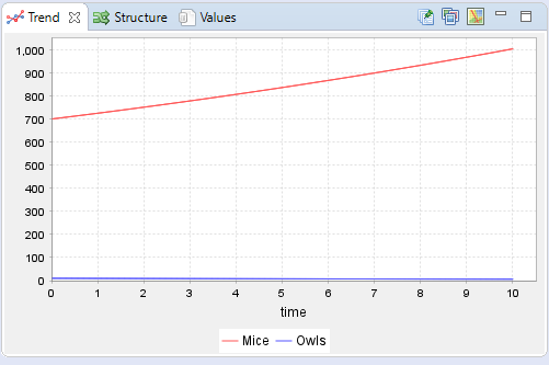
Results for Mice and Owls
As you can see, the simulation is complete, but the results do not reveal anything interesting. We need to extend the simulation time.
Select Configuration from the Model Browser. In the properties view change stop time to 300.0 and simulate again.

Model configuration
After the simulation is complete, Select Mice and Owls again.
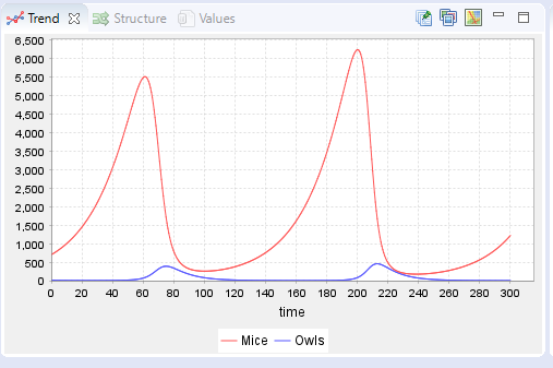
Results for Mice and Owls, extended simulation time
Now we can see the wanted behavior. As the mice population reaches a certain point the number of owls start to increase as they have more food. The increase in owl population lowers the mice population, leading to starvation between owls. The lowered owl population in turn allows the mice population grow back, and the cycle continues. In fact this model simulates the behavior of a pair of first-order nonlinear differential equations also known as Lotka-Volterra equations.
However, we can see that there is something wrong with the results; the peaks of the mice population are not on the same level. We are using a step-size that is too long. On default the step size is calculated by dividing the simulation time to 500 equal steps, meaning that the previous results were obtained using a step size of (300-0)/500=0.6. (For a more bizarre behavior try simulating with a stop time of 950 using the default step size.)
To combat this we can set the step size manually from the model configuration, the same place where we changed the simulation stop time. Change the step size to 0.01 and output interval to 1. Output interval allows us to manually configure the step size of the results, meaning that we can make the numerical errors arbitrarily small by lowering the simulation step size, while only having to handle a part of the steps used for the simulation. With these new parameters we now get the correct results.
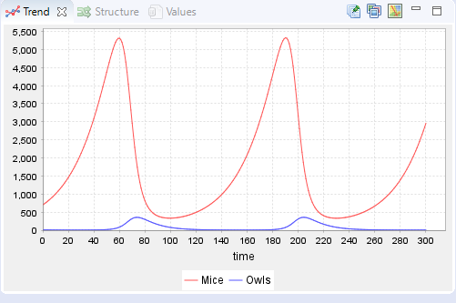
Results for Mice and Owls with a simulation step size of 0.01
Result analysis
In this chapter we are going to go over how to analyze the resulting model structure, use comment symbols, create and export graphs in form of charts and export the simulated dataset. Let's start with the model structure analysis.
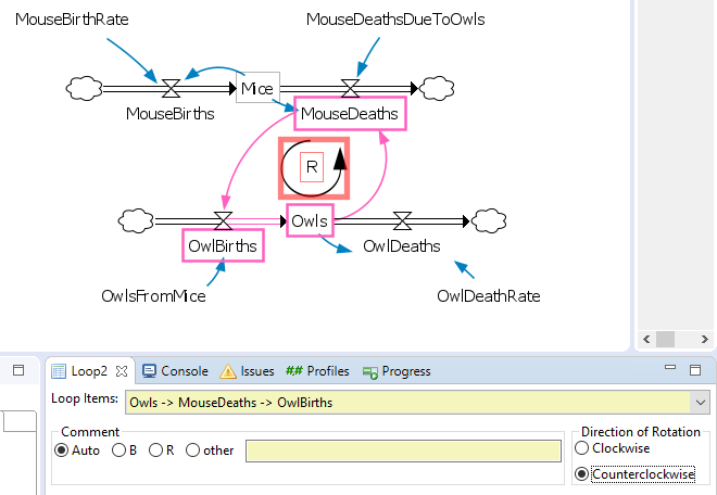
Often in system dynamics we are interested in how different feedback loops are formed inside of a model. There is a built in tool analyzing these. Open Structure view that is located between Trend and Values views, then select Loops tab. The contents update depending on the active selection, select OwlBirths symbol.
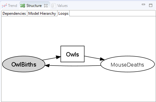
The loop structure of OwlBirths
We can see a feedback loop of 3 variables. You could interpret this loop as follows: owl births increase the number of owls, the more owls there are the more mice are going to get eaten, the more mice that end up as food the more owls can breed.
To make a visual representation of this feedback loop on the diagram we can utilize a comment symbol called Loop. Expand the CommentSymbols from Symbols and drag the symbol between Mice and Owls symbols. Then, from the properties view select Owls→MouseDeaths→OwlBirths from Loop Items and change the Direction of Rotation to counterclockwise. The Comment option is used for telling if the loop is reinforcing (R) or balancing (B). The symbol automatically detects this behavior, but you can also choose this manually or write your own explanation, if you wish. When you make the Loop symbol as your active selection it automatically highlights the symbols that are included in the loop to visualize how it is formed.
Loop comment symbol
The other comment symbol, called Comment, is purely for writing text in the diagram. It is useful, for example, when you want to have memos inside the diagram, or when you want to write an explanation for a design choice.
Let's move on to graphs. There are two ways of creating them, Trend view (that we have used before) and Charts. Trend view allows you to export the graph as .svg and .png file formats from the top-right controls. However, the built in graph tool has much more options for customizing a graph. Let's create a phase-space plot of the model.
Start by creating a new chart by right-clicking on the folder Charts under your model, then select New→Line Chart.
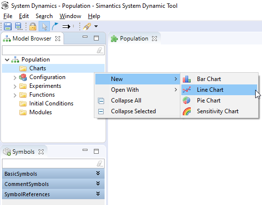
Creating a new chart
Double click the newly made chart to open it and keep the chart selected to access its properties. Name the chart Phase-space plot, tick hide title and hide legend options, type Owls as the x-axis variable and change the label name to Alive owls.
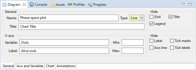
Chart general properties
Then, select the Axis and Variables tab on the bottom, click on y-axis and rename label to Alive mice, then click Add variable. Select the <Write variable name> and write Mice as the variable name.
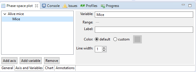
Chart Axis and Variables properties
Now you should have a completed phase-space plot of the prey-predator model. To export a graph right click on it and select either Save as→PNG or Print... and select the pdf printer of your choice. Notice that in order to see results on the graph you need to have an active experiment that has finished a simulation.
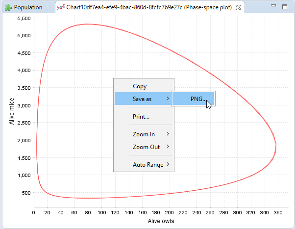
Completed phase-space plot and export options
You might also want to export the simulated data. Currently the easiest way is to copy it to your clipboard. First, select all components by clicking on the diagram and pressing Ctrl+A on the keyboard. Then, select Values view from the bottom left, click on any numerical value to put the field in focus, finally Ctrl+A and Ctrl+C. Now you have all of the numerical data on your clipboard for pasting to the tool of your choosing.
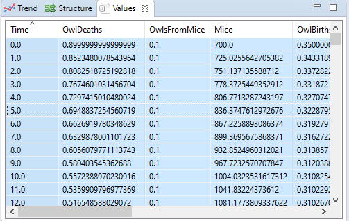
Values view
This concludes the basic tutorial. If you wish to learn more about the advanced features of the tool, please refer to the wiki or the advanced tutorial.
Happy simulating!